What Makes Nonprofit Websites Stand Out?

Your website is the face of your nonprofit. It’s one of your strongest tools for marketing your mission and building a community of support for your organization.
But to get the word out about your work and grab people’s attention, your website has to stand out from the crowd. This will require not just sophisticated messaging, but also a knowledge of design best practices that actively promote what makes your nonprofit unique!
After all, the content on your website drives all your digital fundraising and outreach efforts. This means your website needs to be both functional and identifiable as belonging to your organization.
The best way to learn about design is to study successful examples and identify why they work. In this article, we’ll explore two examples of stellar websites in the nonprofit sector:
- Center for Earth Ethics
- Aspen Community Strategies Group
The strategies used on these websites are applicable to any type of nonprofit, regardless of mission or overall objectives. Are you ready to learn what can help make your nonprofit website stand out? Let’s jump in.
Center for Earth Ethics 
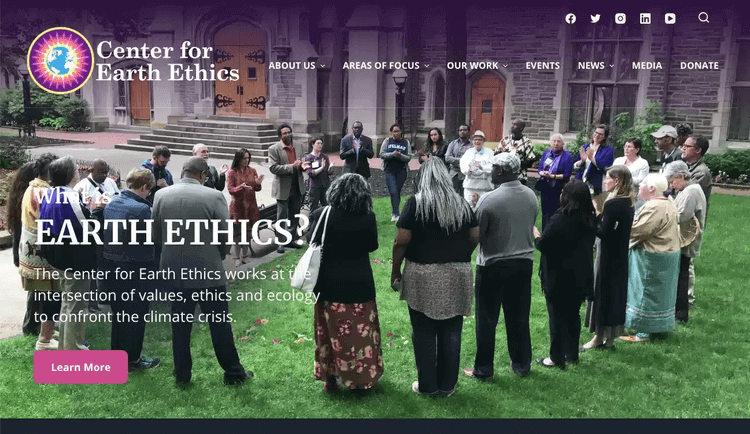
The Center for Earth Ethics makes a strong first impression on website visitors. It’s apparent from a look at the hero image on the homepage that this is a nonprofit that works to bring people together to confront the climate crisis.
Key Features
Let’s take a closer look at some of the stand-out features of the Center for Earth Ethics website:
- Strong imagery and vibrant colors: Aside from the hero image on the homepage, the Center for Earth Ethics’ site has a number of photographs across its pages that illustrate its two main focuses: people and the planet. By opting for photographs of real people in action, the Center invites visitors to picture themselves as part of the solution. Plus, the Center’s brand colors—yellow, pink, purple, and turquoise—are used throughout to give the site a distinct and cohesive look.
- Regularly-updated blog: This nonprofit clearly keeps its supporters in the loop. By posting regularly on its blog, the Center for Earth Ethics is not just communicating news related to its mission—it’s also giving website visitors a reason to return to the site again and again, and signaling that the organization is active.
- Events page: Showcasing book launches, online courses, panel discussions, lectures, conferences, and more, the Center for Earth Ethics’ events page is a robust hub listing every event the organization is involved with. By clicking on individual events, visitors can get an overview of what the event entails, time and location details, and information about how to sign up. A thorough event page like this helps to engage and excite the organization’s event attendees well before the big day.
The Center for Earth Ethics website offers a wealth of resources and information, and with an easy-to-navigate menu and clickable CTA buttons all over the site, it’s set up to invite everyone to join in the fight against climate change.
Takeaways For Your Own Website
This nonprofit website is a great example of an effective, memorable site that drives engagement and support.
To emulate The Center for Earth Ethics’ approach, first consider ways you can strengthen the visual look and feel of your website. Whether you’re relying on graphic design services or uploading your own photos to your site, think about how the imagery and colors of your site connect to your mission and values. For example, if your mission is focused on Bengal tiger conservation, it would make sense to have photos of tigers across your website and a color scheme similar to Bengal tigers’ signature orange and black stripes.
Second, brainstorm ways you can offer regular updates on your website. You might consistently post on your blog, share a weekly podcast episode, or keep up with up-to-date events on a monthly calendar. Give your website visitors a reason to come back seeking new information, just as the Center for Earth Ethics does with its blog.
Finally, consider highlighting your most important pages in the menu. One of the pages the Center highlights, for example, is the Events page. For your organization, it might make sense to draw attention to your donation page, volunteering page, or newsfeed. Use what you know about your supporters to decide how best to organize the pages on your website and draw traffic to those resources.
Aspen Community Strategies Group

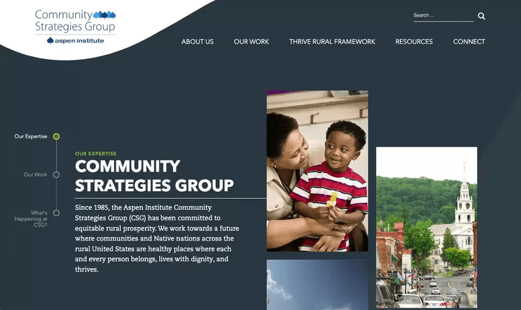
Aspen Community Strategies Group (Aspen CSG) offers a sleek, professional website experience. The site shines a bright light on its mission to achieve equitable rural prosperity.
Key Features
Here are some of the key features that help the Aspen CSG website stand out:
- Mobile-responsive web pages: This nonprofit recognizes the importance of having a website designed for mobile devices. Every web page resizes correctly in a mobile view, with buttons and images resizing to fit the screen size, as well. This means that Aspen CSG’s audience can easily access its tools and resources on the go.
- Easy-to-use faceted search box: Visitors can access a search box from any page on the website. By typing a keyword into this search box, users quickly receive various results related to the subject they searched for, helping site visitors find specific information. This convenient element makes it more likely that they’ll return to use the site again and again.
- About Us page: The site also offers an About Us page that provides information about Aspen CSG’s mission, expertise, team, and advisory groups. This page builds the nonprofit’s credibility with its visitors and roots the entire site in its larger mission.
Another eye-catching element of Aspen CSG’s site is its homepage, which covers everything from the organization’s approach to current news. As you scroll, white text pops against dark background colors of gray, orange, and green, and clickable buttons invite visitors to learn more and sign up for an email newsletter.
Takeaways For Your Own Website
This website is an effective online hub for Aspen CSG’s information and resources, and also looks professional and inviting.
So, what best practices from Aspen CSG can you apply to your own site?
First, ensure that your website is optimized for mobile devices. Cornershop Creative’s guide to the best nonprofit websites stresses that this is key to making your site one of the best in the industry. Whether people are viewing your website on their phones, tablets, laptops, or desktop computers, they should be able to interact with all of your content and tools.
In addition to ensuring accessibility on any device, take your efforts to the next level by making your site accessible to people of all abilities. Apply proper header classification to your content, make any forms navigable by keyboard, and add alt text to images and captioning or transcripts to video and audio elements.
Second, make it easy for visitors to find the information they’re looking for. Even if you don’t add a faceted search bar to your site, you can still take an amateur-friendly approach to organizing your information. Highlight the most important pages in your navigation menu and nest related pages underneath them. You can also showcase key resources on your homepage.
Finally, consider adding an About Us page to your website, too. This can be a great place to establish what your organization is all about. You can share information like your mission and vision statements, and spotlight your team members. Also use this page to include a link to your latest annual report to illustrate the impact your work is having on your community.
These two websites are strong examples of what’s possible for nonprofit organizations on the web. Use the best practices highlighted in this post to get started revamping or designing your own website, and consider working with a nonprofit web design company to take your site to the next level.


